Our Work / Redwood & Co.
Branding a Global Collective of Learning & Development Consultants
Thinking about How to Grow your Business?
Two heads are better than one!
Background
Redwood & Co. is an international collective of highly experienced partners including Learning and Development Leaders, Specialists, Business Coaches and Trainers. The team brings a unique understanding and practice of transformational learning at organisational and personal levels.
Redwood work collaboratively with each other to ensure clarity, alignment and execution of today’s objectives while building capability for tomorrow for their clients and their organisations.
The Brief
We were challenged with conducting market and client research to unearth what differentiates Redwood & Co from other international collectives. Using insights obtained, we strategically positioned the brand to achieve set business objectives.
Once the brand strategy was approved, we developed a bespoke design concept and designed a brand identity that would resonate with existing and prospective clients.
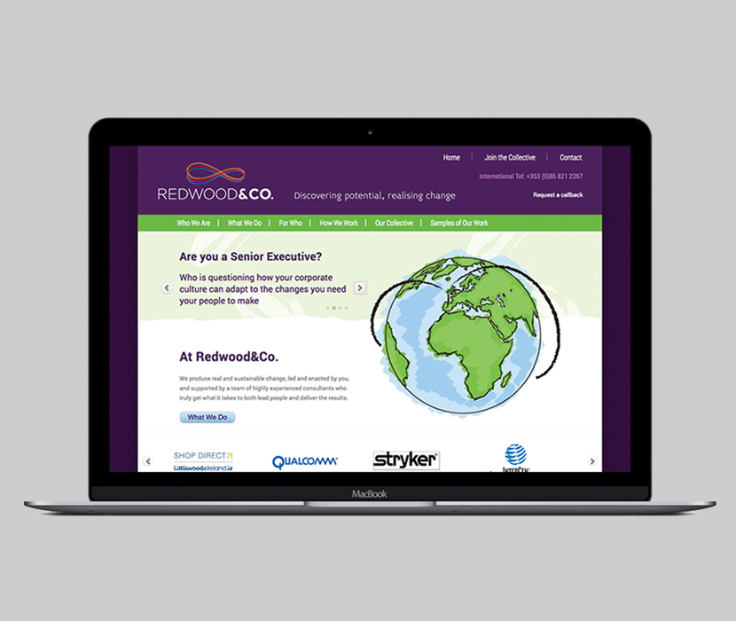
Subsequent to brand sign-off, we activated the brand’s narrative and look & feel across traditional and online channels.
Research & Insights
Qualitative research methods were utilised in this rebranding project to gain an understanding of internal stakeholders and marketplace perceptions. The following key insights influenced the brand strategy:
Strengths: Formidable reputation, progressive nature, values, leadership, personality and expertise.
Differentiators: Lateral thinking, ability to bring out the best in people & their way of connecting with clients and making them feel important.
Key value proposition: Global messages delivered locally.
Redwood & Co was described using the following words: “Connected”, “Innovative” “Solutions”.
Brand Strategy
Brand Positioning
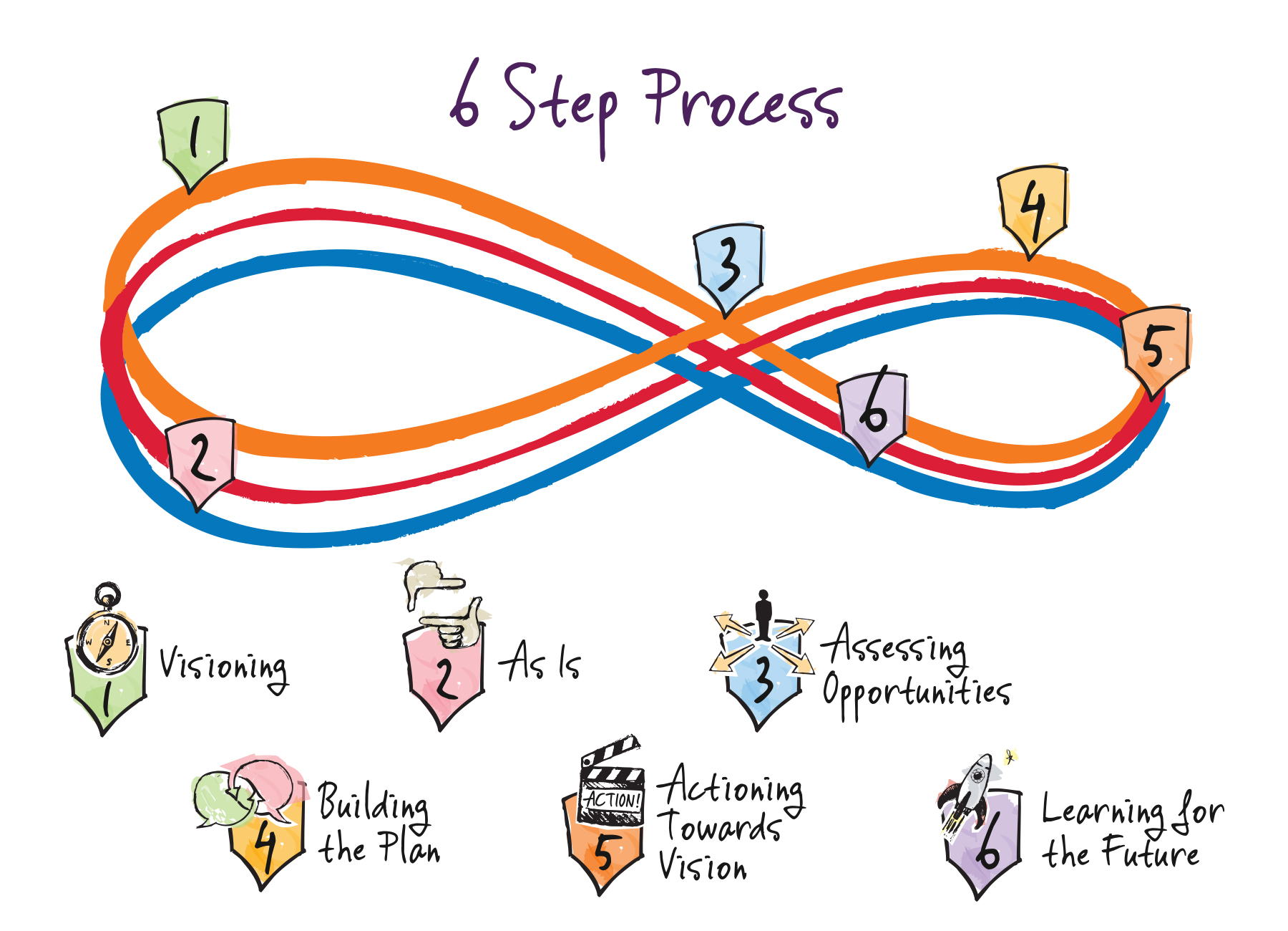
Redwood & Co. produce real and sustainable change, led and enacted by their clients, and supported by a team of highly experienced consultants who truly get what it takes to both lead people and deliver the results.
Brand Positioning Message
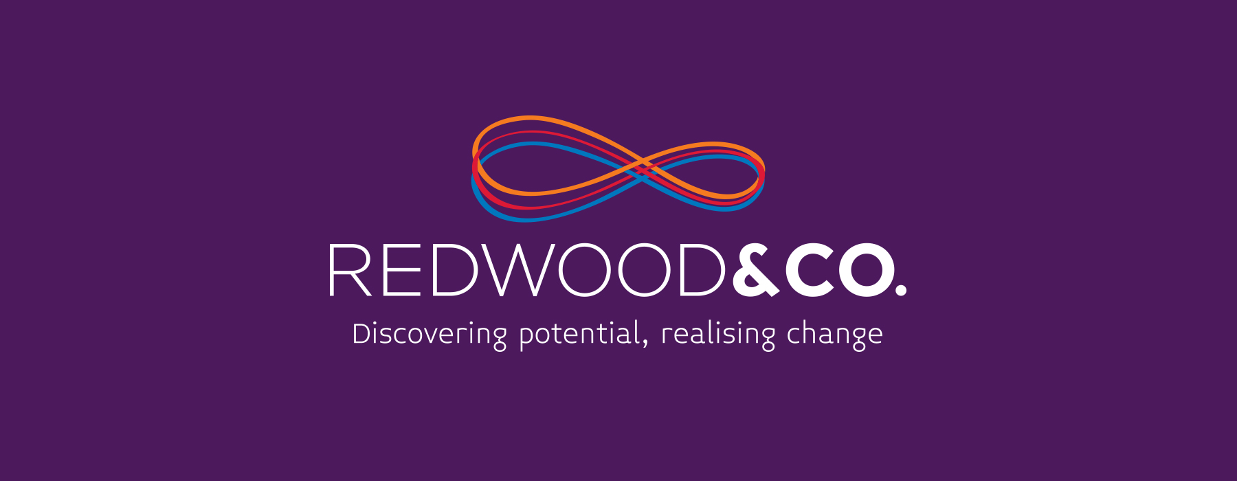
Discovering Potential, Realising Change
Brand Identity Design
The brand identity concept focussed on the mobius strip. This is a surface with one continuous side formed by joining the ends of a rectangular strip after twisting one end through 180°. The elliptical symbol had been in use to represent infinity even before the Möbius strip was discovered.
Used in the context of Redwood & Co’s solutions, the mobius strip represents the continuous development of people’s core skills and capabilities that are necessary for high performing organisations.

Brand Activation

Solutions Delivered
Brand Strategy
- Market Research & Analysis
- Strategic Brand Workshop
- Brand Positioning
- Brand Vision
- Brand Communications Strategy
Brand Design
- Brand Identity Design
- Brand Identity Guidelines
- Brand Communications Collateral
- Stationery Suite Design
- Website Design & Development