Our Work / Bella Italia
Rebranding a Family owned Italian Restaurant
Thinking about How to Grow your Business?
Two heads are better than one!
Client Testimonial
Hugh McMahon, Director
The Background
For many Limerick people, Bella Italia is an institution, having first opened its doors for business in 1990. To celebrate its 25th year in business, Frawley’s challenge was to develop and position Bella Italia for growth in the coming years.
Down through the years, the business evolved and survived very turbulent economic times, continuing to flourish from year to year. In recent times the market has become very competitive with many new businesses now competing on Bella’s doorstep. The business owners wanted to stand out from the crowd and focus on those people who are looking for fresh, authentic Italian food in the heart of Limerick City.
Brand Positioning
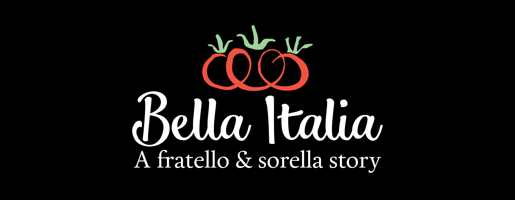
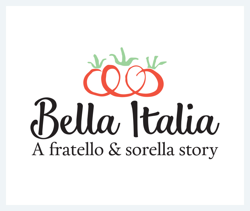
A Fratello & Sorella Story
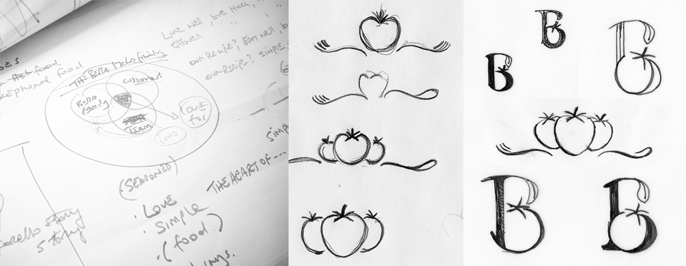
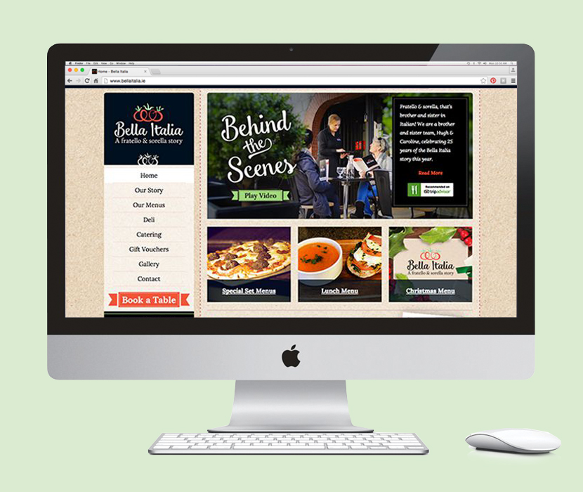
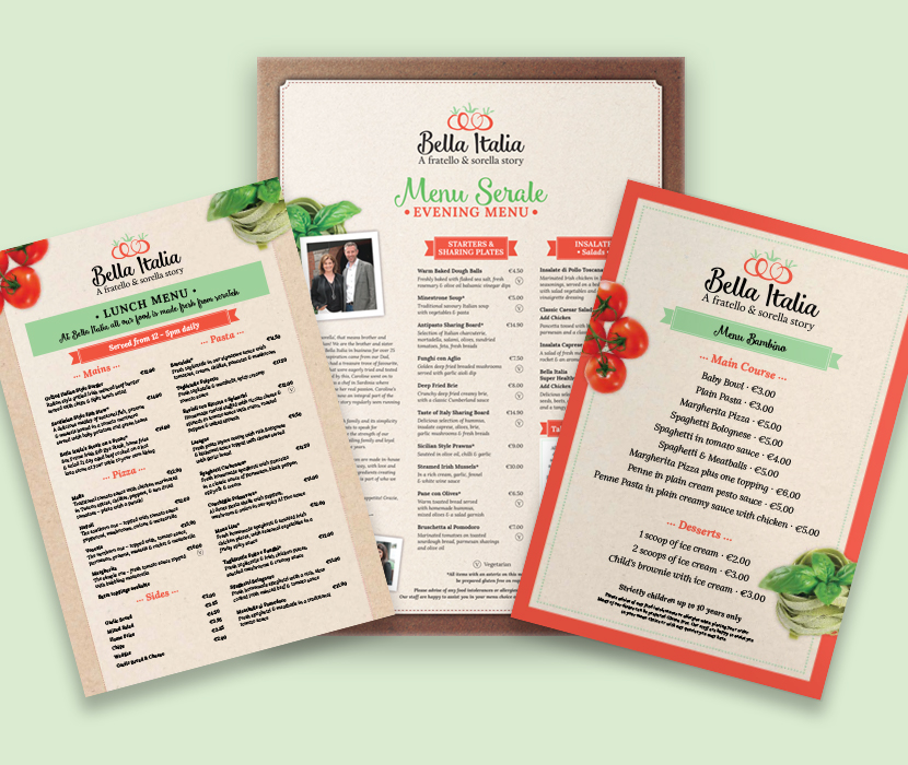
We dug deep into the brand and carried out customer and internal stakeholder research to ascertain Bella Italia’s ‘who’ and what exactly makes it unique. It became very clear that this is a family story. We felt that this story specifically needed to be told, developing a new core message, ‘A Fratello & Sorella story’ (meaning ‘a brother and sister story’) for the business, to help position it for growth. We carried this through to a new brand identity incorporating the core message and then executed this along with their brand story across multiple touch points including signage, menus, video, photography, packaging, labels, social media and a new mobile-responsive website. As the next chapter in their story unfolds, we wish them every success. #afratello&sorellastory
Brand Identity
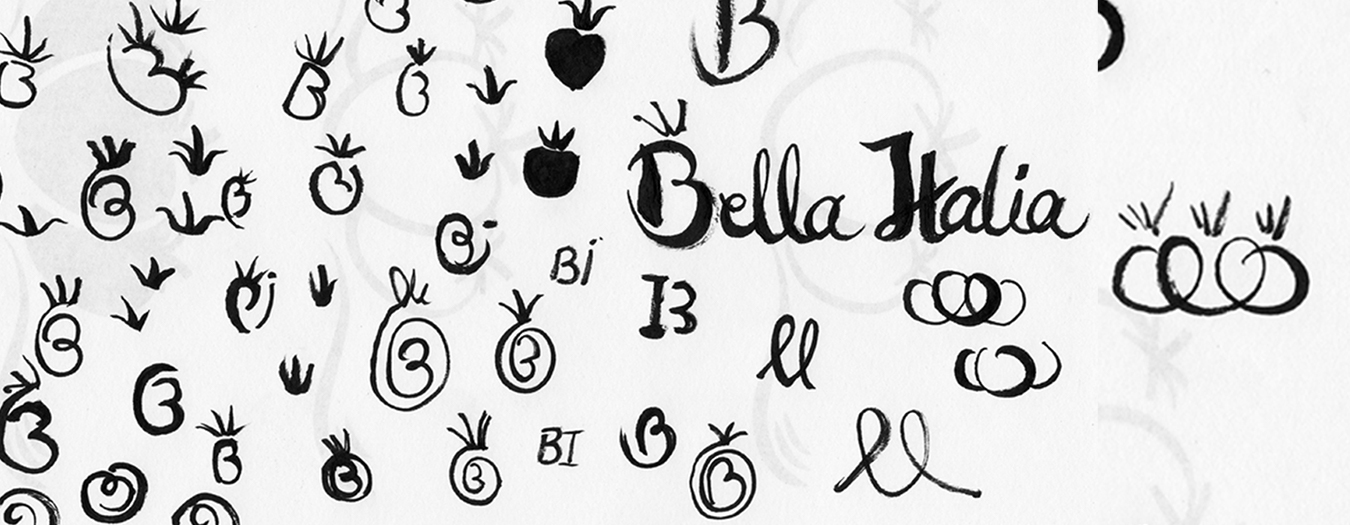
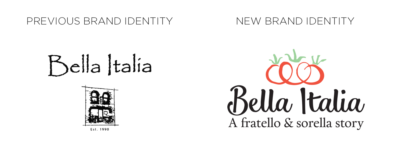
During our research, Caroline commented “It’s all about the Tomatoes!” The tomato is the simplest of ingredients and is the cornerstone of Italian food. We created a symbol consisting of 3 interlinking tomatoes that represent the key ingredients of the Bella Italia story: the Bella Italia family, their loyal customers and their love of cooking consistently great food. This simple, hand rendered illustration evokes the passion and energy behind the Bella Italia name. The symbol is supported by an energetic font, stylised to suit. The colour palette is simple. Red and green serve to communicate not only the tomato motif, but also the love the Bella Italia team has for creating authentic Italian dishes. Black is timeless and sophisticated and its perfectly suited to this established brand.
Brand Activation


Solutions Delivered
Strategy
- Customer Research
- Brand Workshop
- Brand Positioning
- Brand Vision and Mission
Activation
- Brand Identity Design
- Brand Standards and Guidelines
- Photography Library
- Videography
- Website Design
- Signage
- Marketing Collateral
- Packaging Design